- Μηνύματα
- 3.691
- Reaction score
- 6.580
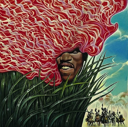
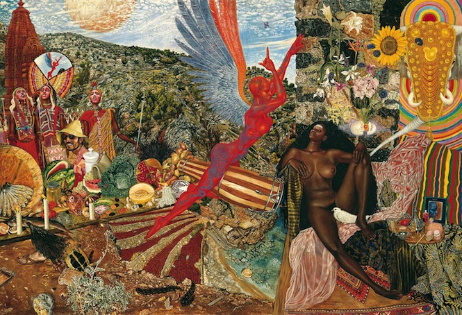
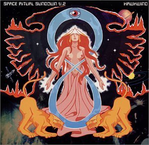
HAWKWIND - SPACE RITUAL 1973
Eνα εξωφυλλο ΥΠΕΡΠΑΡΑΓΩΓΗ.
(για φανταστειτε το σε βινυλιο)
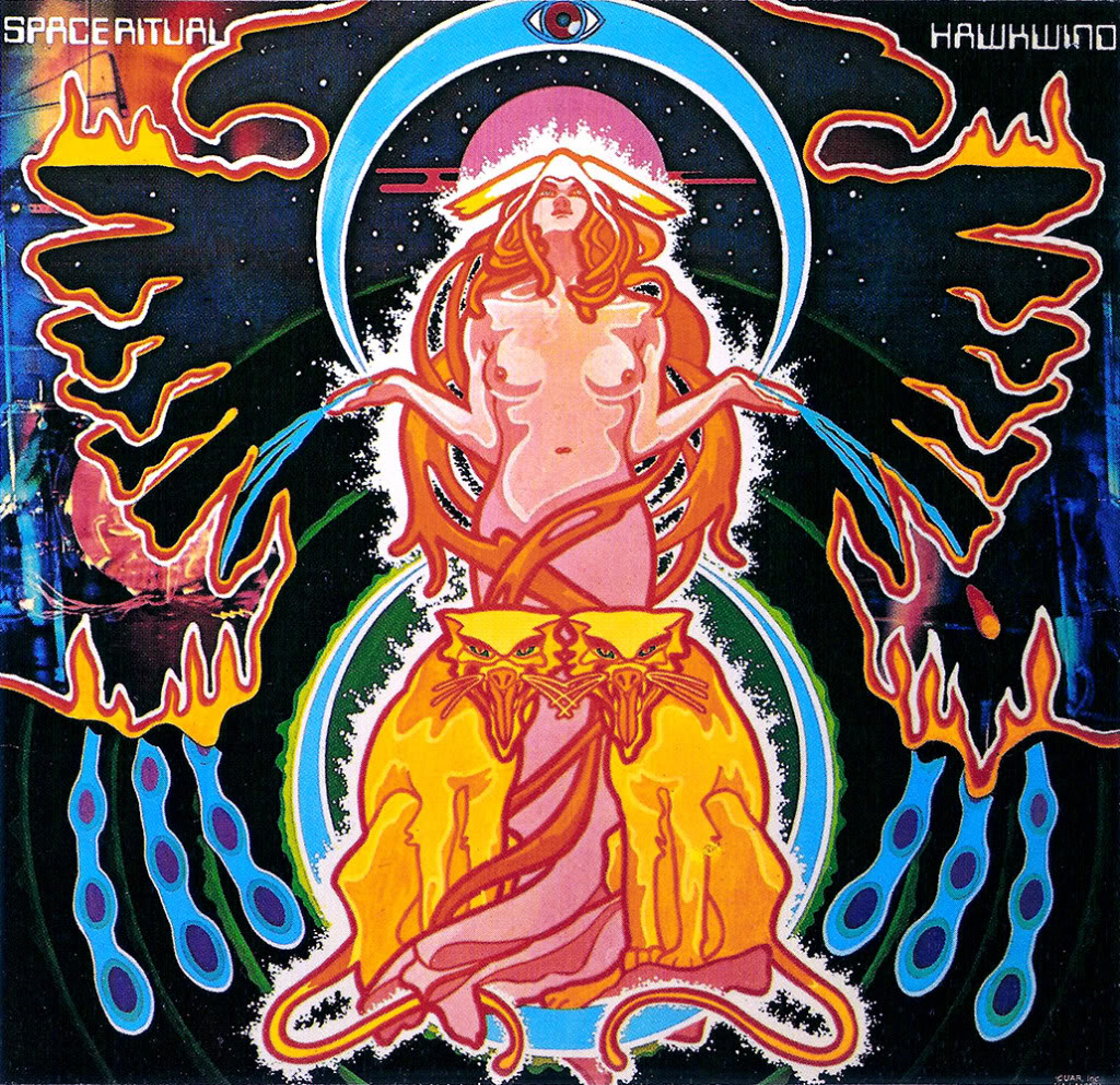
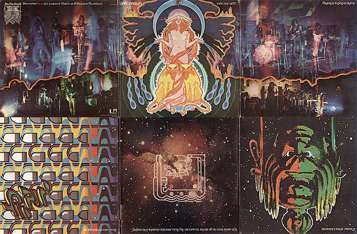
Eνα εξωφυλλο ΥΠΕΡΠΑΡΑΓΩΓΗ.
(για φανταστειτε το σε βινυλιο)


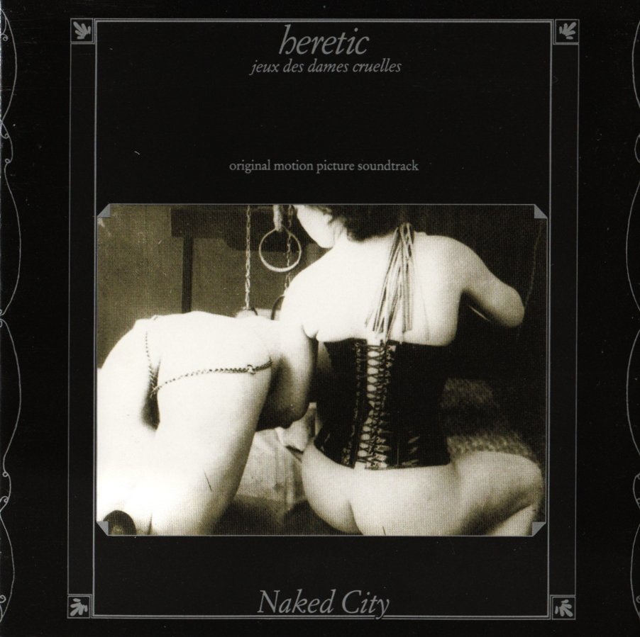
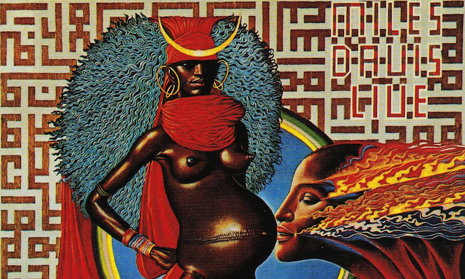
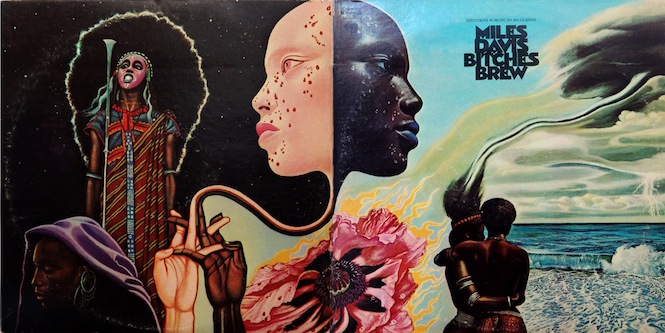
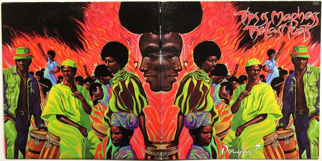
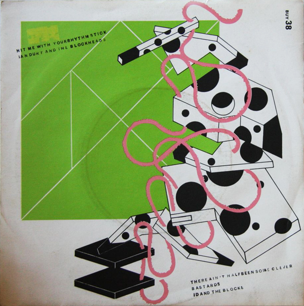
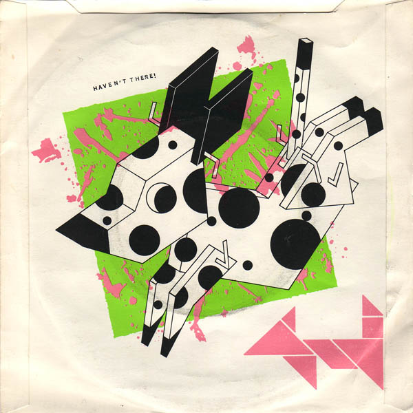
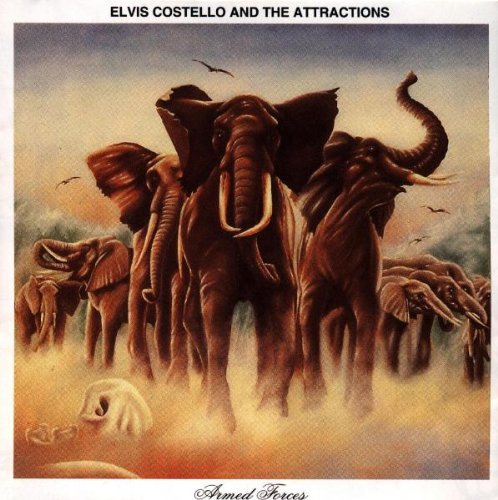
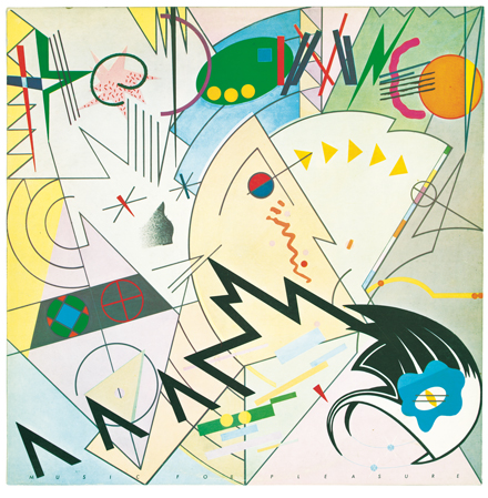
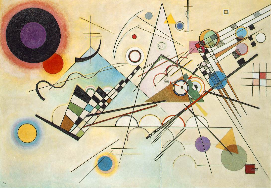
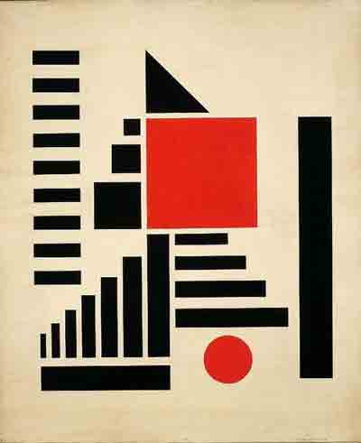
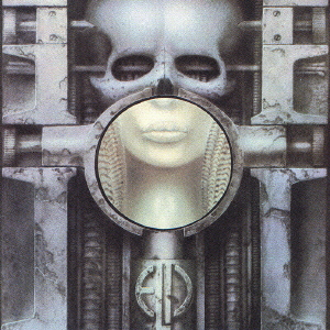
Σε πολλά από αυτά έχει βάλει το χέρι της η Hipgnosis, όπως σωστά αναφέρθηκε και παραπάνω από τον Castra...Η εποχη του prog rock αρχες 70 εδωσε κατα τη γνωμη μου επικα εξωφυλλα