Alex Steinweiss: the story of the world’s first record sleeve artist

Μηνύματα
5.650
Reaction score
9.839
αρθρο για την κυριακη με τον πρωινο καφε.....κατα προτιμηση πριν ξυπνησει η γυναικα σας και τα παιδια:D


Words: Steven Heller

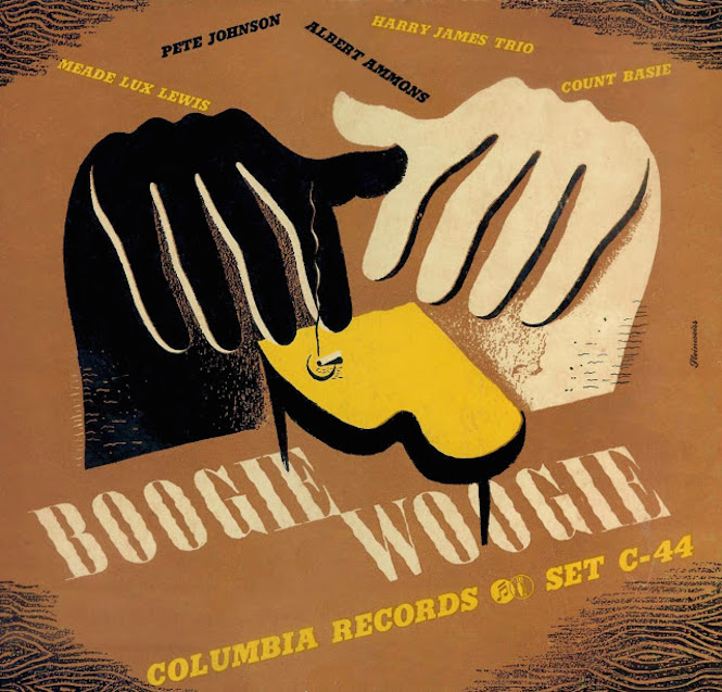
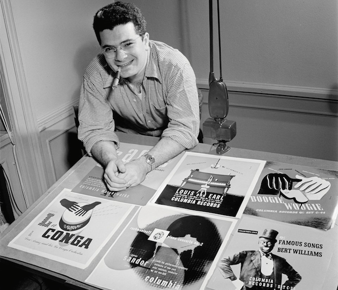
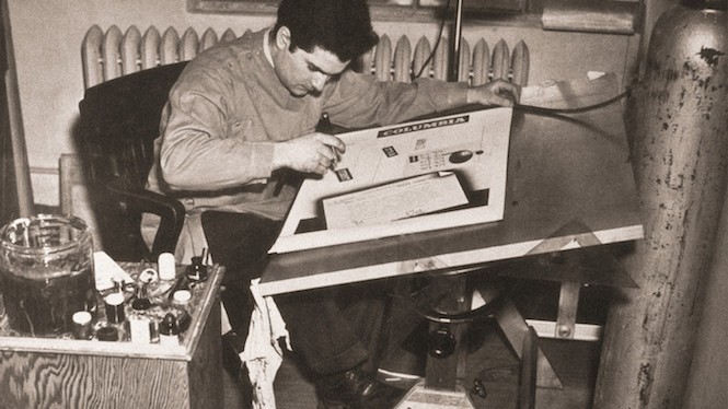
In 1938, Alex Steinweiss designed the first illustrated 78 rpm record album cover and in 1953 he invented the first paperboard 33 1/3 LP container, the standard for music packaging for over thirty years.


Original record album art did not exist before Steinweiss stumbled into the field. Art for sheet music was common but the recording industry barely had a graphics tradition at the time that the twenty-two year old commercial artist was hired to design promotional pieces for a small recording firm, The American Gramaphone Company, later renamed Columbia Records.

Back then, shellac 78 rpm records were packaged in albums of three or four disks sheathed in separate, kraft paper sleeves that were bound between pasteboard covers. These drab albums were referred to as tombstones because they sat spine out in rows on display shelves and were differentiated by various color bindings with gold or silverleaf embossed titles.

Dedicated record shops were also rare and albums were often relegated to nooks in appliance stores, usually adjacent to the record players. Point-of-purchase displays were often the only sales inducement.

Prior to Columbia, RCA Victor, then the largest American record company, had made a half-hearted attempt to tip-on master paintings on its covers, but on albums they lacked verve and spontaneity. Otherwise the record album was a tabula rasa just waiting for some intrepid pioneer, like Steinweiss, to make commercial art history.

Steinwiess was born in 1917in New York. His immigrant Polish father loved music and instilled the same passion in his son. From 1930 to 1934 Steinweiss attended Abraham Lincoln High School where in the second term he entered a special graphic design program taught by Leon Friend and became a fervent member of the school’s “art squad,” responsible for posters and flyers.


Μηνύματα
5.650
Reaction score
9.839
On the strength of his high school portfolio he earned a scholarship to Parsons School of Design in New York and graduated in 1937, after which he worked as an assistant to Joseph Binder, the Viennese poster artist. In 1939 he left to open a small studio of his own. After six months doing menial jobs he was called by Dr. Robert Leslie, co-founder of New York’s prestigeous Composing Room and editor of PM magazine, and asked if he was interested in the CBS records job.

CBS records was headquartered in the gloomy industrial city of Bridgeport, Connecticut. There were no graphic arts suppliers, typographers, or designers anywhere within range. But Steinweiss didn’t mind. He was given space in the corner of a huge barn-like room that he called “the ballroom.” He was given a drawing table, tank of air, and an airbrush and told to design promotions, posters, booklets, and catalogs. He said he “put some style into it,” eluding to the difference between his European Modern-influences and the turgid approaches of the other record companies. His work had flair and seemed to attract attention. For the first six months he worked endless days – sometimes designing fifty pieces a week.

Then he had an epiphany: CBS was selling their records in unattractive paper wrappers, so he told his superior that he wanted to design art covers for the albums. To his surprise he was allowed to do a few despite the fact that manufacturing costs were bound to increase. The very first illustrated album was a Rogers & Hart collection, released in 1940. He created a theater marquee with the album title spelled out in lights. It was simple but direct.


Cover for Smash Hits From Rodgers & Hart. Listen HERE

He did a few more and sales dramatically rose. Shortly after the first covers were issued, Newsweek reported that sales of Bruno Walter’s Beethoven Eroica symphony surged to a 895% increase over the same release in a unillustrated package.


Cover for Bruno Walter’s Eroica

Steinweiss’ covers were designed as mini-posters following in the 1930s French and German graphic tradition – flat colors and isolated surreal and symbolic forms used for metaphoric effect. Steinweiss believed that rather than a staid portrait of the recording artist, musical and cultural iconography (sometimes witty and cartoon-like) would attract the audience’s eye. Moreover, since he loved music with such passion, he presumed that his interpretations would likewise have universal appeal.

The best of his images were not decorative but rather commented on the music. For Songs of Free Men by Paul Robeson, he composed a graphic monument to the horrors of slavery – a chained hand holding a knife that resonated as a symbol of heroism.


Cover for Paul Robeson’s Songs Of Free Men

Similarly, the mamoth black and white hands hitting piano keys on Boogie Woogie was a statement of protest in an era when racial segregation (even in the music industry) was tolerated.


Cover for Boogie Woogie

Working in Bridgeport significantly influenced Steinwiess’ design as much as any formal or stylistic considerations. Without type suppliers nearby he hand lettered all the titles himself and developed his own trademark script, Steinweiss Scrawl, which was licensed by Photolettering Inc. in the early 1950s. And since the local photoengravers worked only in black and white, process color was not a viable option. This meant he had to do all his work as hand color separations.

Today the biggest hurdles in record album design are the marketing people and those artists with final approval rights. Back then marketing experts were benign and even the most temperamental recording artists offered much less trouble, at least in relation to Steinweiss. The field was too new, and no one had time to figure out what, if any, restrictions or taboos should be. Success was its own reward. And many jazz greats and classical maestros enthusiastically applauded Steinweiss’ success at increasing their sales. Leopold Stokowski, for one, wouldn’t have anyone else do his covers.


Cover for Leopold Stokowski’s Uirapuru

World War II interupted Columbia’s steady release of records, and Steinweiss took a civilian job with the Navy. After the war, Steinweiss was put on retainer as a consultant to the President of Columbia Records, Ted Wallerstein.

During one of their routine lunch meetings, Wallerstein was acting mysterious. He walked over to his desk and took a record out of his drawer, put it on the turntable and as Steinweiss listend he also instinctively waited for the record to end. With 78s one got into the habit of waiting for the record to change every four or five minutes, but this one didn’t change. The one side played for twenty minutes and Wallerstein announced that it was the first pressing of an LP record’ [Developed by Dr. Goldmark for the famed CBS Labs]. He then looked Steinweiss and said, “we’ve got a packaging problem.” The package makers tried using Kraft paper envelopes but owing to the heaviness of the folded paper marks were left on the microgroove when they were stacked up. Wallerstein concluded that they had to solve this “or we’re up the creek,”


Steinweiss developed the folded prototype for a cardboard container or jacket that could hold the LP (the inside sleeve was invented by someone else). That was the easy part. Next he had to find a manufacturer willing to invest around a $250,000 in new equipment to print, fold, and glue the thing. He enlisted his brother-in-law to locate a manufacturer. The LP package was a thin board covered with printed paper – four color printing on the cover and black-and-white on the liner side – became the standard for the industry.

Although Steinweiss owned the original patent, his contract with Columbia stipulated the he had to waive all rights to any inventions made while in their employment. The rest is history.

Steinweiss’ invention was not merely effective protection for LPs, it allowed more artistic variety, which for its inventor was a mixed blessing. More advanced printing encouraged the use of photographs, which eclipsed the kind of graphics that Steinweiss had introduced. Studio photography became vogue; dramatic mood portraits and clever setups were popular. Steinweiss preferred the illustrative and typographic approaches but he also art directed and designed photographic shoots for London and Decca records. Indeed he worked for many of the major labels during that period, and sometimes used a pseudonym (Piedra Blanca). Nevertheless, by the late 1950s the pop labels wanted photographs exclusively.

At the age of 55 Steinweiss reluctantly decided to “bow out” of the record business, he continued to do package and graphic designs until moving to Sarasotta, Florida, where he began painting and poster making for, among other things, the local symphony orchestra.

Steinweiss launched a new field and practiced in it for well over twenty years. During his heyday, few designers were as focused on a specific discipline, or as influential. His covers visualized music in the same way that decades later music videos added a completely new dimension. Although he eventually left the field, his contribution is no less significant to the marketing and the history of American popular culture. He passed away in 2011, aged 94, in Sarasota, Fla.


Τελευταια Μηνυματα

Staff online

Μέλη online

ΣΤΑΤΙΣΤΙΚΑ

Threads
175.898
Μηνύματα
3.033.184
Members
38.517
Νεότερο μέλος
DimAster
Top